Visualising connected hosts with a Python-generated network diagram

The bulk of cyber security incidents are fairly simple, but sometimes you end up working with a whole network of hosts that are connected to each other in different ways. With this scenario in mind, I recently set out to explore the possibility of creating a Python script to automatically generate a simple network diagram to visualise things more clearly.
Setting things up
Before we get properly started, another Python project means another block of setup code where we prepare the libraries and files that we’ll be using through the rest of the script.
import networkx as nx
import matplotlib.pyplot as plt
source = open("hosts.txt", "r")
G = nx.Graph()
NetworkX is the library we’ll be using to plot the diagram, while Matplotlib will be used to export it as a pretty PNG. Our input will be a file called hosts.txt with a line per host in the format: “source_hostname:connected_host_1,connected_host_2,connected_host_3”. For the sake of simplicity, the NetworkX graph function will be abbreviated to “G”.
Producing lists of hosts and connections
The first thing we need to do is make sense of hosts.txt and build definitive lists of all the hosts and connections that will be included in the final network diagram.
all_hosts = []
for line in source:
    line = line[:-1]
    host_record = line.rsplit(":", 1)
    all_hosts.append(host_record[0])
    sub_hosts = host_record[1]
    sub_hosts = sub_hosts.split(",")
    all_hosts.extend(sub_hosts)
all_hosts = set(all_hosts)
all_hosts = list(all_hosts)
source.seek(0)
Let’s start with the hosts. These are before the colon on each line, so all we need to do is split each line at the colon and add the preceding text to a Python list. Then we use the source.seek function to return to the start of the input file ready for our next actions.
all_links = []
for line in source:
    line = line[:-1]
    host_record = line.rsplit(":", 1)
    current_host = host_record[0]
    current_connections = host_record[1].rsplit(",")
    for connection in current_connections:
        to_append = current_host + "," + connection
        all_links.append(to_append)
source.seek(0)
Now we repeat the process for the connections, which is a little more complicated because there are more than one per source host. Again we take the source hostname from before the colon, but this time we split what comes afterwards at each comma and create a new list entry for each connection in the format “source_hostname,connected_hostname”.
Plotting the hosts and connections on the diagram
Now that we’ve successfully arranged our two datasets, it’s time to plot them as nodes and lines on a diagram using NetworkX, which is a fairly simple process.
for host in all_hosts:
    if host == "":
        pass
    else:
        G.add_node(host)</pre>
First, we iterate through the list of hosts, adding each as a node on the diagram. The if statement here checks to see if an entry in the list is blank and ignores it, which helps to prevent errors if your initial hosts.txt file contained any blank lines.
for link in all_links:
    all_links_dict = {}
    first_part = link.split(",")[0]
    last_part = link.split(",")[1]
    all_links_dict[first_part] = 0
    all_links_dict[last_part] = 1
    G.add_edges_from([all_links_dict])
Once again, the process is slightly more complex for the connections, which need to be split into two segments (the source hostname and the destination hostname). Once these parts are added to a dictionary, NetworkX will accept them as the two ends of an edge (or line).
Exporting a pretty diagram
The final step is to generate the network diagram with NetworkX and then export it as a PNG image with Matplotlib, which is a fairly self-explanatory few lines of code.
nx.draw(G, with_labels=True, font_size='6', node_color="blue", node_size=160, font_color="white")
plt.savefig("graph.png", dpi=500)
source.close()
Note that both functions have a series of attributes that can be tweaked to your heart’s content (there are more than I’ve used here, too). When we’re finished, we also close the source file to keep things nice and tidy and allow us to edit it with other programs.
The output
So what do we get for our trouble? The result is a neat little PNG network diagram that makes visualising the network you’re investigating much easier.
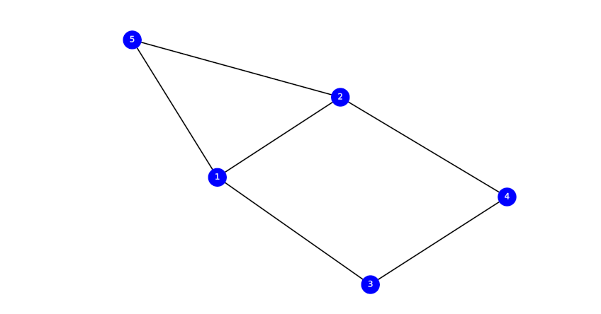
If yours isn’t as tidy as mine, try playing with the various formatting attributes in the last step, or simply try executing your Python script again – NetworkX sometimes cycles through a few different layouts if it is run again, and some of them are a lot prettier than others.
A note: I’m only just delving into the world of Python, and these posts are as much to get things straight in my own head as they are to show them to others. If anything looks wrong, or there’s a more efficient way of doing something, please let me know!
Photo from Pexels